"Story Page" is a project aimed at redesigning Yami's landing page, providing the team with a diverse selection of components and empowering them to create landing pages for campaigns with dynamic content. The goal is to improve the landing page's performance and increase conversion rates through the strategic use of components and dynamic content, resulting in higher engagement and improved business outcomes.
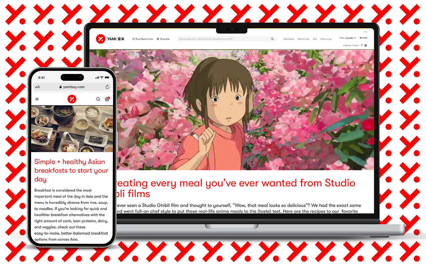
Yami's stagnant CMS landing page design and lack of modern features have resulted in users being drawn away to competitors who offer more compelling content and user-friendly interactions. This has led to decreased user engagement and potential loss of customers.
By designing the "Story Page" with improved design, flex layout, and user-friendly features will lead to increased user engagement, higher conversion rates, improved customer retention, and a stronger competitive position in the market.
We interviewed customers to identify common pain points with the current landing page.
Limited components in the current CMS system lead to a dull and uninspiring landing page layout.
Inconsistent branding on the landing page creates trust issues and confusion among users.
Unclear CTA leads to confusion, resulting in lower conversion rates and missed engagement opportunities.

The research phase aims to identify key factors that influence user behavior and preferences in relation to online shopping, storytelling, and engagement with landing pages, all with the ultimate goal of increasing sales.
Here are some key insights:
Streamlined Experience:
Concise and uncluttered designs, featuring clear messaging and intuitive navigation, are highly favored by users, particularly in the realm of e-commerce.
Storytelling for Conversions:
Utilizing visual elements such as images, videos, and infographics to tell a compelling story can create a memorable and engaging experience for users, which is more likely to lead to purchases.
Mobile in Mind:
With the increasing use of mobile devices for online shopping, it's crucial to ensure that the page is optimized for mobile viewing and provides a seamless experience.
We are aiming to develop a variety of types of components to display more dynamic content, while maintaining consistent branding for trust and cohesion. Clear and prominent buttons will guide the shopping journey to help users easily find and engage with desired products or content.
We utilized long pages with filmstrip-like layouts, grid systems that behave like text, and strategic use of typographic contrast and whitespace to create a cohesive and visually appealing design for the layout; and to make the page more like a complete story.

The design approach aimed to strike a balance between refinement and simplicity, with the ultimate goal of telling a compelling story, educating customers, and guiding them toward making a purchase. While additional elements were added to the design for refinement and structure, we aimed to retain the refreshing and unfussy simplicity of the initial layout attempts.
Prototype on Figma

We used a component-based approach for the Story Page design to provide flexibility to the team in assembling pages according to their needs. This allows for modular and reusable building blocks, enabling easy layout rearrangement, adaptation, and scaling.
Here are some examples:

During test sessions, refinements were made based on feedback, including increasing the font size and adjusting the layout for product information. However, two significant design-related issues were identified.
PC: The hero banner section occupies excessive space, nearly obscuring the first screen.
Mobile: The "A Row N Column" section occupies excessive space on the mobile end, potentially hurting the visual hierarchy.
Solution: Make image section heights flexible based on the assets, incorporate them into adaptive rules, and include recommended sizes for each section in the content guide.

After the launch, additional components were designed & developed to cater to the team's diverse needs, providing flexibility and versatility in displaying more dynamic content and enhancing the user experience for seamless navigation and engagement.

Wins:
The operation team has expressed a strong preference for the Story Page over the CMS when it comes to campaign planning, indicating a high level of satisfaction and approval.
The implementation of the Story Page has led to a significant improvement in customer engagement, resulting in an increase in GMV (by 15%), Conversion Rate (by 13%), and Unique Visitors (by 17%).
Takeaways:
Always consider different sizes of screens, especially the mobile, which 85% of our customers purchase from.
The benefits of incorporating storytelling elements into a landing page design to create a more engaging and memorable user experience.
The advantages of using a flexible and dynamic component-based approach to landing page design allow for greater customization and adaptability to changing campaign needs.
2023 all rights reserved, Daniel Xuanang Zhou

